
So you want to make your WordPress site look amazing with cool sliding pictures and text? Well, Slider Revolution Plugin is one of the best plugins for this job. It helps you create those moving images you see on websites that change by themselves or when you click buttons.
This plugin might seem hard at first, but don’t worry. We’ll walk through everything step by step so you can make great sliders for your website.
What is Slider Revolution?
Slider Revolution is a WordPress plugin that lets you make interactive sliders. These are those moving picture shows you see on many websites. You know, the ones where images slide from left to right, or fade in and out with text on top.
The plugin comes with lots of ready-made templates. You can use these as they are, or change them to fit your needs. It also has drag and drop tools, which means you can move things around without knowing any code.
Many people use this plugin because it works well and looks professional. It’s not free, but it’s worth the money if you want your site to look really good.
Why Use Slider Revolution?
There are many reasons why people choose this plugin:
- It makes your website look modern and professional
- You don’t need to know how to code
- It works on phones and tablets too
- Lots of templates to choose from
- You can add videos, not just pictures
- It loads fast when set up right
- Good customer support
- Regular updates
The plugin helps grab people’s attention when they visit your site. A good slider can show your best content right away and make visitors want to stay longer.
Don’t Have WordPress Installed Yet?
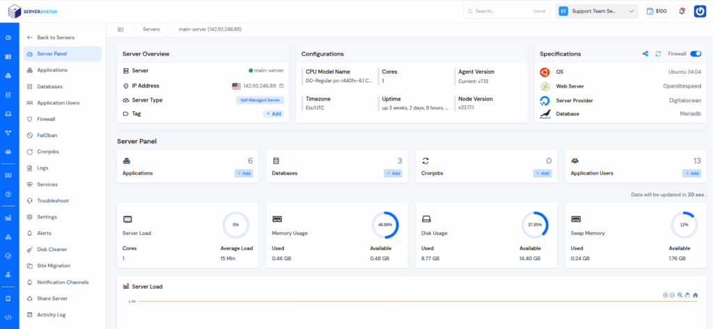
If you haven’t installed WordPress on your server yet, you can use ServerAvatar to do it easily in just a few clicks. ServerAvatar lets you deploy and manage your servers and applications without any technical hassle.
With its one-click application installer, you can launch your WordPress website instantly. In addition to that, it offers features like automatic SSL installation with automatic renewal for free, domain management, scheduled backups, easy PHP setting configuration, file manager, database management, log monitoring, and cronjob manager.
Everything is managed from a single, clean, and user-friendly dashboard. Whether you’re a developer, agency, or business owner, ServerAvatar simplifies your workflow and saves you time.
Get Started with ServerAvatar now and deploy your WordPress site easily using one-click installer without any technical hassles.
How to Install Slider Revolution
First, you need to buy the plugin from their website. You can’t get it from the WordPress plugin directory because it’s a paid plugin.
Here’s how to install it:
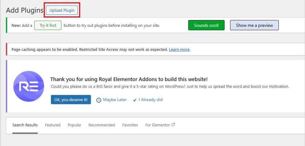
- Go to your WordPress admin area
- Click on “Plugins” then “Add Plugins”
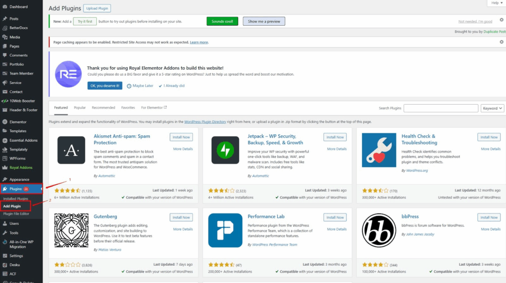
- Click “Upload Plugin” at the top
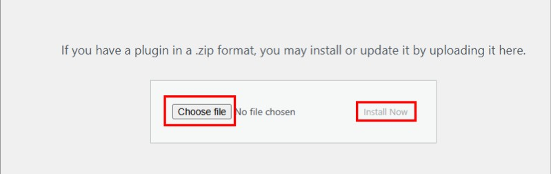
- Choose the zip file and Click “Install Now”
- Then click “Activate”
After you activate it, you’ll see “Slider Revolution” in your WordPress menu. That’s where you’ll do all your work with sliders.
First Steps with Slider Revolution
Now that you’ve got Slider Revolution installed and working, you’re ready to make amazing sliders. But wait – before you jump into creating your first slider, there are some basic settings you should change first.
Setting Up Basic Responsiveness
You probably already know that most people look at websites on their phones these days. So you want to make sure your slider looks good on all devices – phones, tablets, and computers.
To set up these important settings, go to your WordPress dashboard and click on “Slider Revolution”

then “Globals”.

You’ll see lots of settings here, but don’t worry! We’ll only focus on the ones that make your sliders work well on different devices.
Understanding Device Sizes
Every device has its own screen size, measured in something called pixels. Here’s what you need to know:
Desktop Computers Regular computer monitors are usually 1920 pixels wide. So we put 1920 in the “Desktop Grid Width” field.
Notebooks and Laptops This includes all laptops, MacBooks, and tablets held sideways. Most of these are around 1600 pixels wide, so that’s what we’ll use.
Tablets When people hold tablets upright (like when reading), they’re usually about 778 pixels wide. That’s the size of an iPad held normally.
Mobile Phones This one’s tricky because phones come in so many different sizes. But here’s the thing – don’t go bigger than 500 pixels! I usually use 480 pixels, which works for almost all phones.

Why not bigger? Well, if you make it too big, people with smaller phones won’t be able to see everything on your slider. And guess what – more than half of all website visitors use phones now!
Quick tip: You can use the same number for tablets whether they’re held sideways or upright. Just use 1025 pixels if you want to keep it simple. But I think it works better when you separate them.
Here are the numbers I recommend:
- Desktop: 1920px
- Notebook: 1600px
- Tablet: 778px
- Mobile: 480px
Once you put in all these numbers, don’t forget to click “Save Global Settings” at the bottom!

Understanding the Main Screen
When you open Slider Revolution for the first time, you’ll see the main screen. Don’t get scared – it looks complicated but it’s not that bad.
The main parts you need to know about:
Module Library This is where all the ready-made templates live. There are hundreds of them! You can find templates for restaurants, shops, portfolios, and more.
My Modules This shows all the sliders you’ve made or imported.
Getting Started This section has helpful videos and guides to help you learn.
Creating Your First Slider
Now that you’ve set up the basic settings, it’s time to make your first slider! Let’s do this step by step and keep it simple.
Starting a New Slider
Go to the Slider Revolution tab in your WordPress dashboard and click on “New Blank Module”. This will open up the slider editor where all the magic happens.

Giving Your Slider a Name
First thing you need to do is give your slider a good name. Look on the right side for something called “Module Naming” under the “Title” tab.
Let’s call our first slider “My First Slider Revolution” – just type that in the Title field.
There’s another field below called “Slider Alias”. This is important! You need to put the same name here, but in lowercase with dashes instead of spaces. So it would be “my-first-slider-revolution”. You’ll use this alias later to add your slider to your website pages.

Choosing What Type of Slider You Want
Now you need to pick what kind of slider you’re making. Look for the “Layout” tab and you’ll see three choices:

Slider Pick this if you want more than one slide. This is what most people choose.
Scene Choose this if you only want one slide. The navigation arrows and dots will be hidden automatically since there’s only one slide to show.
Carousel This one shows multiple slides at the same time in a 3D spinning effect. It looks cool but most people don’t need this.
For your first slider, I’d suggest picking “Slider” since it’s the most common and useful.
Setting the Right Size
Next, you need to decide how big your slider should be. Still in the Layout tab, you’ll see sizing options:
Auto The slider will be whatever size its container is. Good for smaller sliders in the middle of pages.
Full Width The slider goes all the way across the screen but the height changes based on the device.
Full Screen The slider fills the entire screen no matter what device people use.
Most people use “Full Width” for sliders at the top of their homepage. If you’re not sure, go with that one.
Fine-Tuning for Different Devices
Here’s something important – you need to make sure your slider looks good on all devices.
You’ll see that the “layer grid sizes” are set to “Auto Sizes” for tablets and phones. I recommend changing these by clicking the switch next to each device type.
When you do this, you’ll see the grid sizes from your global settings show up. The grid is basically the area where your text, buttons, and other stuff will appear.
Here are the settings I recommend copying:
- Desktop: 1920px x 1100px
- Notebook: 1600px x 900px
- Tablet: 778px x 960px
- Mobile: 480px x 720px
Don’t worry if this seems confusing – these numbers just make sure your content has some breathing room and doesn’t go right to the edge of the screen.

Some Extra Useful Settings
Before you start adding content, there are a few more settings worth checking:
Slide Duration By default, each slide shows for 9 seconds before moving to the next one. That’s way too long! Most people won’t wait that long. Change it to about 4 seconds (4000ms) instead.

You can find this under “Module General Options” then “Defaults”.
Loading Spinner While your slider loads, people see a spinning circle. You can change what this looks like or turn it off completely under “Module General Options” then “Defaults” then “Spinner”.

Mobile Settings If you want, you can turn off your slider completely on mobile devices. Sometimes this helps your website load faster on phones. Look for “Module General Options” then “General” then “Disable On Mobile”.


Cool Scroll Effects Want to make your slider even more impressive? Under “Module General Options” then “On Scroll” then “Scroll Based Features”, you can turn on some really cool effects:

Parallax effects – makes backgrounds move at different speeds when people scroll
3D effects – adds depth to your slider elements
Mouse sensitivity settings – controls how much the effects respond to mouse movement

There’s also a “Scroll Based Effects” dropdown with lots of interesting effects that happen when people scroll down your page. I suggest you try them all out and see which ones you like!
Navigation Options If you’re making a slider with multiple slides, you can customize the arrows and dots that people click to navigate. Find this under “Navigation Options”. Here you can change:

- How the arrows look and where they appear
- The style and color of the navigation dots
- Whether to show navigation on mobile devices or not
Don’t Forget to Save!
Once you’ve set everything up, make sure to click “Save” at the bottom. If you don’t fill in all the required fields, you won’t be able to start editing your slider.

Now you’re ready to start adding pictures and text to your slider!
The Editor Screen Explained
The editor is where the magic happens. It looks busy, but once you know what everything does, it’s not so bad.
The Timeline At the bottom, you’ll see a timeline. This shows when things happen in your slider. You can drag things around to change the timing.
The Canvas The big area in the middle is where you see your slider. This is what visitors to your website will see.
The Toolbar At the top, there are buttons for adding things like text, images, and shapes.
Layer Panel On the right side, you can see all the parts of your slider listed out. Each piece of text or image is called a “layer”.
Adding and Changing Pictures
Pictures are usually the most important part of any slider. Here’s how to work with them:
Adding New Pictures
- Click the “+” button on the toolbar
- Choose “Image”
- Upload your picture or choose from the media library
- Drag it where you want it on the slider
Changing Picture Size Click on your picture, then drag the corners to make it bigger or smaller. Hold Shift while dragging to keep it looking right.
Moving Pictures Around Just click and drag your picture to move it anywhere on the slider.
Working with Text
Text is super important for telling people what your slider is about. Here’s how to add and change text:
Adding Text
- Click the “+” button
- Choose “Text”
- Type what you want to say
- Move it where you want it
Changing How Text Looks Select your text, then look at the right panel. You can change:
- Font (what the letters look like)
- Size (how big the text is)
- Color
- Bold or italic
Making Text Move This is where Slider Revolution gets really cool. You can make text slide in from different directions:
- Click on your text
- Go to the “Animation” tab
- Choose how you want it to come in
- Pick how you want it to go out
Understanding Animations
Animations are what make Slider Revolution special. They make things move in cool ways.
Types of Animations There are tons of different animations:
- Fade in/out
- Slide from left, right, top, or bottom
- Zoom in/out
- Rotate
- And many more!
Setting Animation Timing You can control when animations happen:
- Start time – when the animation begins
- Duration – how long it takes
- End time – when it finishes
Don’t make animations too fast or people won’t be able to read your text. Usually 1-2 seconds is good.
Making Multiple Slides
Most sliders have more than one slide. Here’s how to add more:
Adding a New Slide
- Look for the slide thumbnails (usually on the left)
- Right-click and choose “Duplicate Slide” or “Add Slide”
- Now you have a new slide to work with
Copying Things Between Slides If you want the same text or image on multiple slides:
- Select what you want to copy
- Press Ctrl+C (or Cmd+C on Mac)
- Go to the other slide
- Press Ctrl+V (or Cmd+V) to paste
Changing Slide Order You can drag the slide thumbnails around to change what order they show in.
Setting Up Slider Controls
People need ways to control your slider. Here are the main options:
Navigation Arrows These let people click to go to the next or previous slide. You can turn them on/off and change how they look.
Dots/Bullets Small dots at the bottom that show which slide you’re on. People can click them to jump to any slide.
Auto-Play You can make slides change by themselves. Set how long each slide shows before moving to the next one.
Making Your Slider Mobile-Friendly
Lots of people will see your slider on phones and tablets. Here’s how to make sure it looks good:
Responsive Settings Slider Revolution automatically tries to make things work on different screen sizes. But you might need to adjust some things.
Testing on Different Sizes Use the preview buttons to see how your slider looks on:
- Desktop computers
- Tablets
- Phones
Adjusting for Small Screens Sometimes text might be too big for phones. You can set different sizes for different devices.
Adding Your Slider to Your Website
Once your slider is ready, you need to put it on your website. There are several ways to do this:
Using Shortcodes Every slider gets a special code called a shortcode. It looks something like [rev_slider alias=”myslider”]. Copy this code and paste it into any page or post.
Using Widgets You can add your slider to sidebars or footer areas using the Slider Revolution widget.
With Page Builders If you use page builders like Elementor or Visual Composer, they usually have special blocks for Slider Revolution.
Common Problems and How to Fix Them
Even experienced people run into problems sometimes. Here are some common ones:
Slider Not Showing Up
- Check that the plugin is activated
- Make sure you copied the shortcode correctly
- Try clearing your website cache
Images Look Blurry
- Use bigger images (at least 1920px wide for full-width sliders)
- Check your image quality settings
- Make sure images aren’t stretched too much
Slider Loads Too Slowly
- Use smaller image files
- Don’t use too many animations at once
- Enable lazy loading in the settings
Text Hard to Read
- Make sure there’s enough contrast between text and background
- Don’t put light text on light backgrounds
- Consider adding a dark overlay behind text
Tips for Making Great Sliders
Here are some tips to make your sliders look professional:
Keep It Simple Don’t try to cram too much into one slide. Focus on one main message per slide.
Use Good Pictures High-quality images make a huge difference. Blurry or pixelated images make your whole website look bad.
Don’t Make It Too Fast Give people time to read your text and see your images. Slides that change every 2 seconds are annoying.
Test Everything Always check your slider on different devices and browsers before publishing.
Match Your Website Style Use colors and fonts that match the rest of your website. Your slider should fit in, not stick out.
Advanced Features to Try Later
Once you get comfortable with the basics, there are lots of advanced features to explore:
Video Backgrounds You can use videos instead of images as backgrounds. This looks really cool but can slow down your website.
Interactive Elements Add buttons, forms, and other clickable things to your slides.
Parallax Effects Make background images move at different speeds for a 3D effect.
Custom Animations Create your own unique animations using the advanced timeline features.
Performance and Loading Speed
Sliders can slow down your website if you’re not careful. Here’s how to keep things fast:
Optimize Your Images
- Use compressed images (try tools like TinyPNG)
- Don’t use images bigger than you need
- Consider using WebP format for better compression
Limit Animations Too many moving parts can slow things down. Keep animations simple and don’t use too many at once.
Enable Caching Use caching plugins to help your slider load faster for returning visitors.
Troubleshooting Common Issues
Sometimes things don’t work the way you expect. Here are solutions to common problems:
Slider Not Responsive Check the responsive settings in the slider options. Make sure “Enable Responsive” is turned on.
Animations Not Working
- Clear your browser cache
- Check if other plugins are causing conflicts
- Try disabling other animation plugins temporarily
Import Errors If templates won’t import:
- Check your PHP memory limits
- Make sure you have enough server space
- Try importing smaller templates first
Keeping Your Plugin Updated
Slider Revolution gets updated regularly with new features and bug fixes. Here’s how to stay current:
Automatic Updates If you bought the plugin with an extended license, you might get automatic updates.
Manual Updates Check the Slider Revolution website for new versions and download them manually.
Backup First Always backup your website before updating any plugins, just in case something goes wrong.
FAQ
Q: How much does Slider Revolution cost?
It usually costs around $29 for a regular license, which lets you use it on one website.
Q: Can I use it on multiple websites?
You need to buy a separate license for each website, or get an extended license that covers multiple sites.
Q: Will it slow down my website?
It can if you use too many large images or complex animations. Keep things simple and optimize your images.
Q: Do I need coding skills?
No! It’s designed for people who don’t know how to code. Everything is done with clicking and dragging.
Conclusion
Well, there you have it – everything you need to know to get started with Slider Revolution! It might feel like a lot of information at first, but don’t worry. Just take it one step at a time.
Start by setting up those basic responsiveness settings we talked about. Then create your first simple slider with just a few slides. Once you get comfortable with the basics, you can try out all those cool animations and effects.
Remember, the key to making great sliders is to keep things simple and focus on what your visitors need to know. Don’t try to cram too much into one slider, and always test how it looks on different devices.
The best part about Slider Revolution is that you don’t need any coding skills to make professional-looking sliders. With a little practice, you’ll be creating sliders that make your website stand out from the crowd.
So go ahead – open up Slider Revolution and start experimenting! Your website visitors are going to love what you create. And hey, if you run into problems, just come back to this guide. We’ve covered all the basics you need to get started.
Good luck with your slider making adventure!