Dashboard
The Log Monitoring Suite Dashboard in ServerAvatar is a powerful centralized tool that offers real-time insights into your application’s performance. It visualizes key metrics such as traffic trends, server activity, error rates, bandwidth consumption, and visitor behavior, helping developers and system administrators make informed decisions quickly and efficiently.
Step 1: First, log in to the ServerAvatar Account.
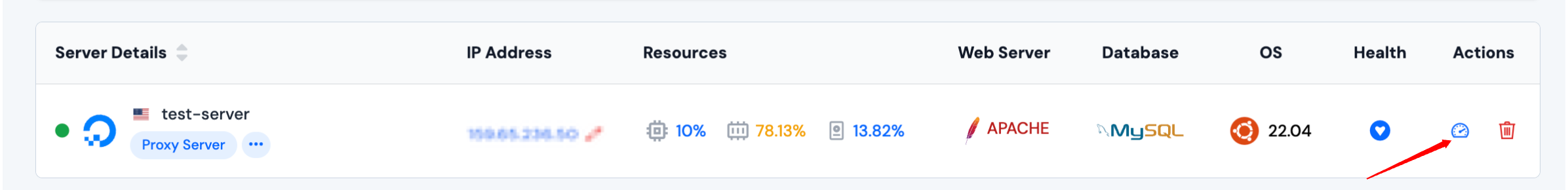
Step 2: Click on the Server Dashboard button.
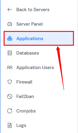
Step 3: Now, you will see the Applications option on the left-hand sidebar of the Server Panel. Click on Applications.
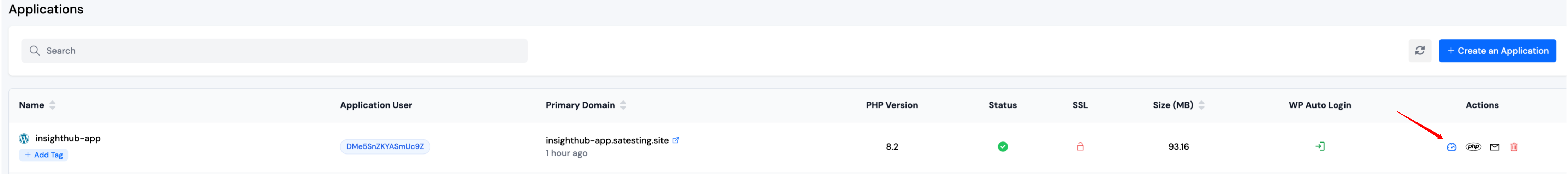
Step 4: Now, you will see the Applications table like the below image. Click on Application Name or Dashboard icon to access the application panel.
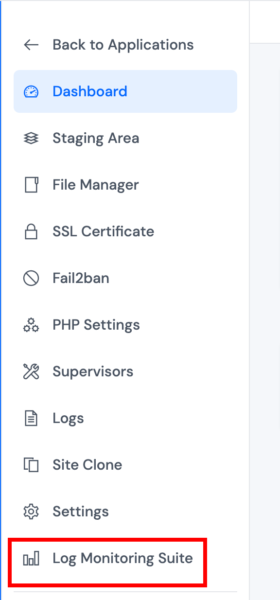
Step 5: Within the Application Panel, locate the Log Monitoring Suite in the left sidebar and click on it. Once opened, it will display a comprehensive overview dashboard for the selected application.
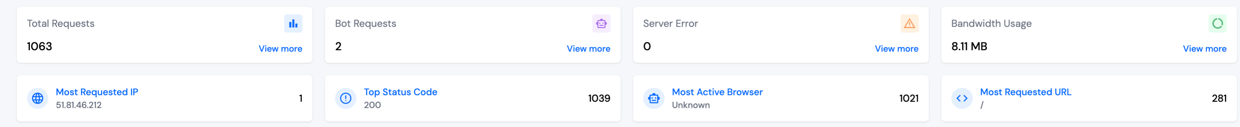
1. Summary Cards
The top of the dashboard features summary cards that provide quick-glance statistics, such as the total number of requests made to the application, bot traffic, server errors, bandwidth usage, most requested IP, top HTTP status codes, most used browser, and the most accessed URL. These cards help you understand overall application activity instantly.
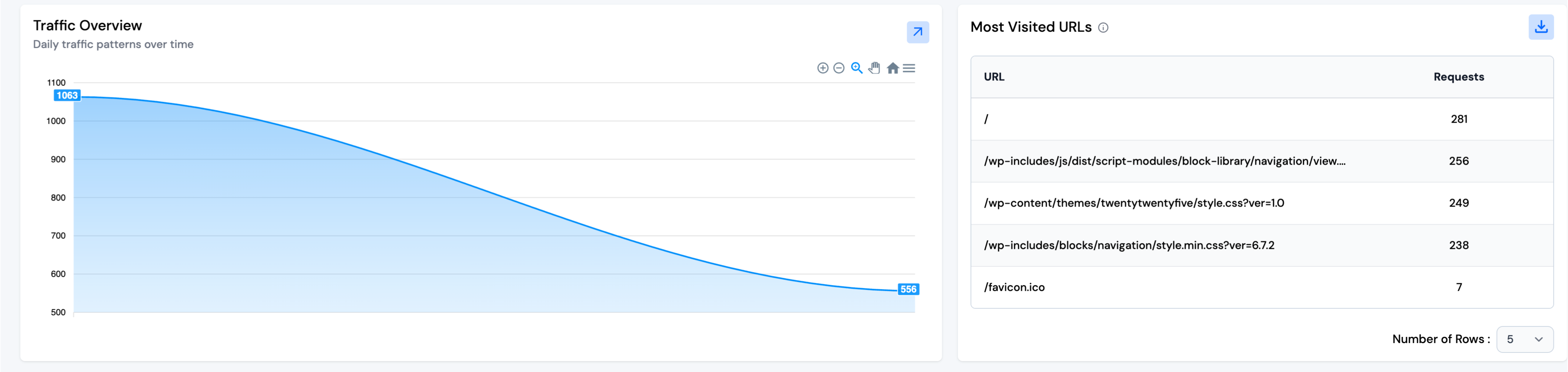
2. Traffic Overview
This section presents a dynamic line graph showing the pattern of incoming requests over time. It helps identify peak traffic periods, spot irregularities, and analyze load trends, allowing you to take proactive steps toward scalability and stability.
3. Most Visited URLs
Here, you’ll find a table listing the most accessed URLs within your application, sorted by the number of requests.
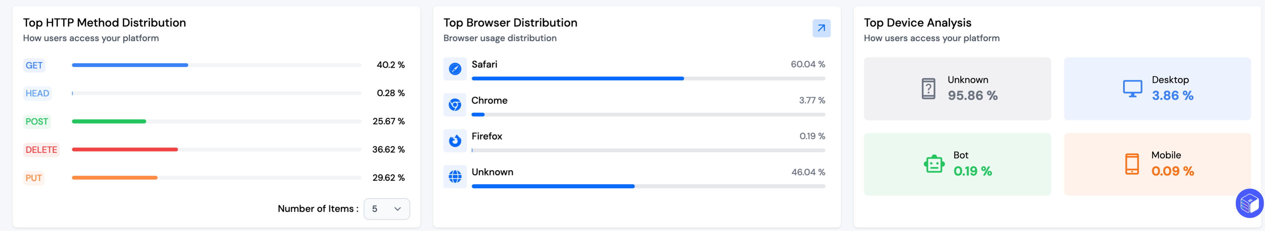
4. Top HTTP Method Distribution
This chart visualizes the distribution of HTTP methods (e.g., GET, POST, PUT, DELETE) used in incoming requests. It helps developers understand how users and systems are interacting with the application’s APIs and resources.
5. Top Browser Distribution
This section displays a breakdown of traffic sources based on the browser used by visitors (e.g., Chrome, Firefox, Safari). It offers insights into user preferences and helps you ensure that your application is optimized across the most used browsers.
6. Top Device Analysis
The device analysis section categorizes users into Desktop, Tablet, Mobile, and Bots. This helps you gauge what type of devices are predominantly accessing your application and optimize UI/UX accordingly.
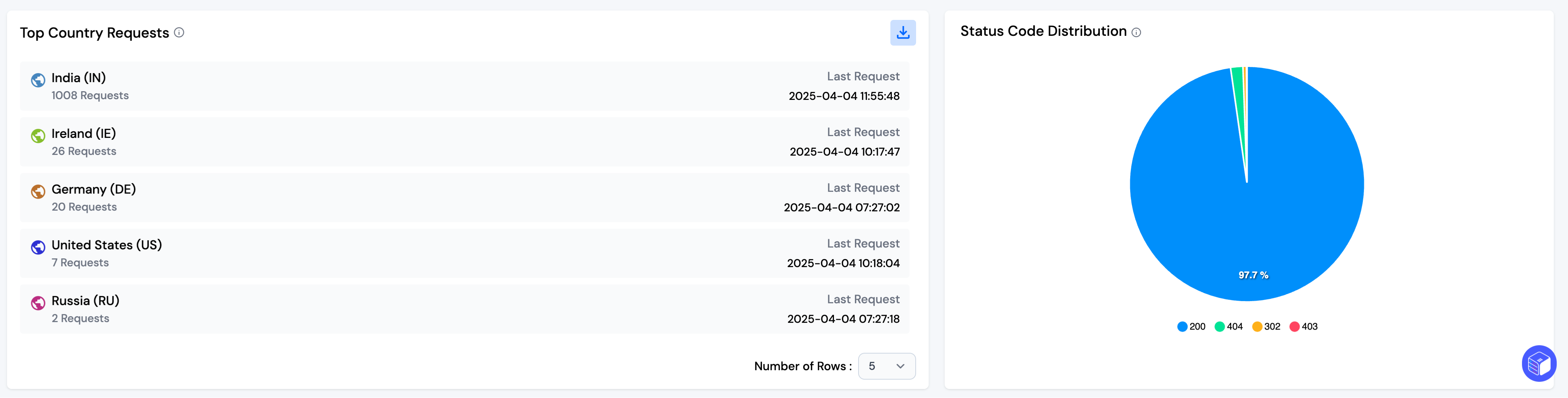
7. Top Country Requests
This feature shows the geographic origin of traffic by listing the top countries sending requests to your application. It includes request counts and timestamps, helping you understand your global audience reach and distribution.
8. Status Code Distribution
Here, you’ll find a pie chart that summarizes the distribution of HTTP response status codes like 200, 301, 404, etc. This is useful for monitoring application health, tracking broken links, and ensuring error rates are within acceptable limits.
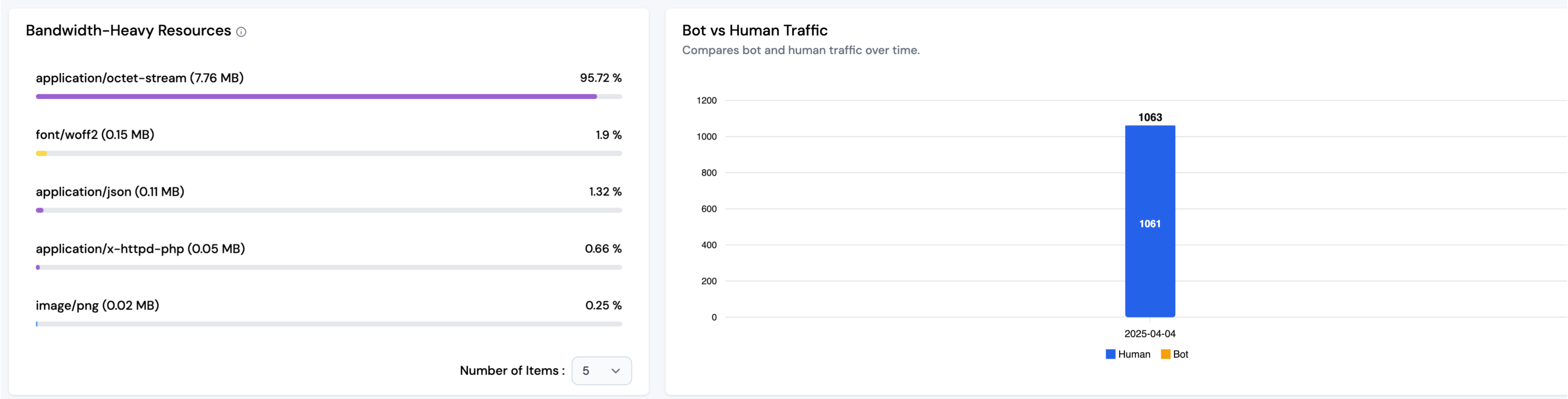
9. Bandwidth-Heavy Resources
This section highlights which types of resources (such as images, videos, scripts) are consuming the most bandwidth. This helps in identifying optimization opportunities to reduce load times and server costs.
10. Bot vs. Human Traffic
Finally, this bar chart compares the volume of traffic generated by bots versus actual human users over time. It aids in identifying bot attacks or excessive bot scraping while giving a clearer picture of genuine user engagement.
Note: You can download the full data of the table as a CSV file using the download button. By default, five rows are shown, but you can increase the count using the dropdown menu.